The Data Visualization Society Atlas

January 11, 2022 | SOTI 2021 Challenge
Every year, the Data Visualization Society (DVS) publishes the results of a community-wide survey to assess the state of the industry, understand who makes up the society in the first place, and see how the organization is changing through the years.
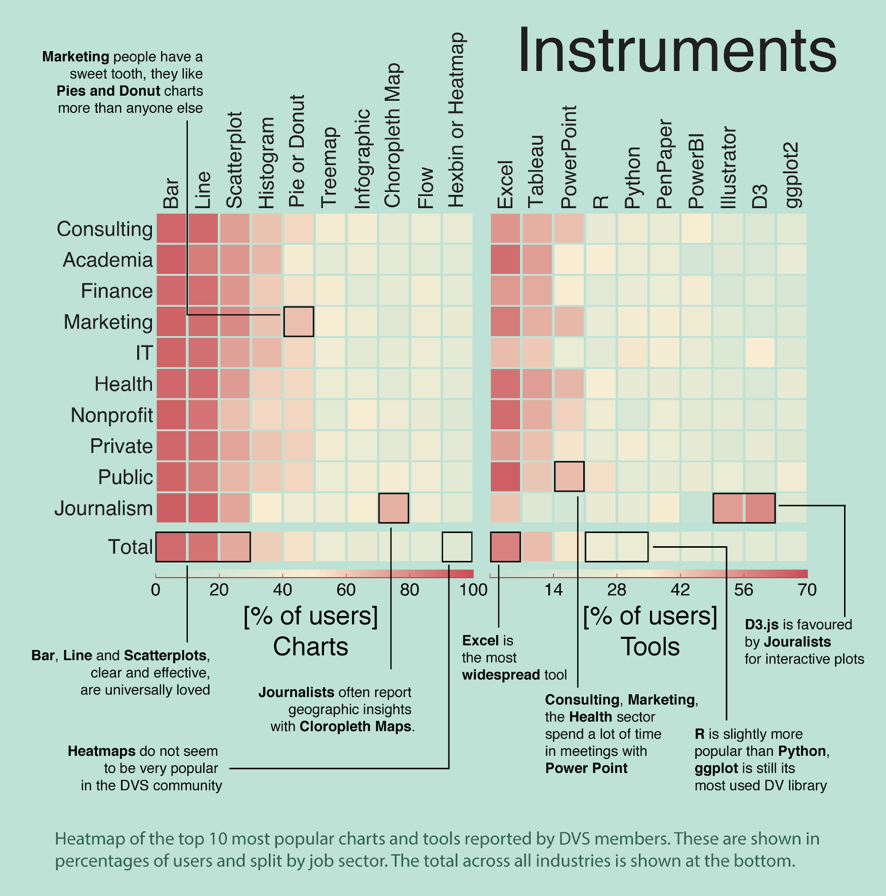
DVS members are encouraged to take the data and design an original visualization to describe or explain the most interesting aspects of the survey.

This is my submission to the explanatory category, the Data Visualization Society Atlas. Click on the image to see the pdf.


The visualization is inspired by cartographic maps and is split into 5 sections. The main one is an atlas representing all the members that answered the 2021 survey, arranged by their job role, education and industry, among others.

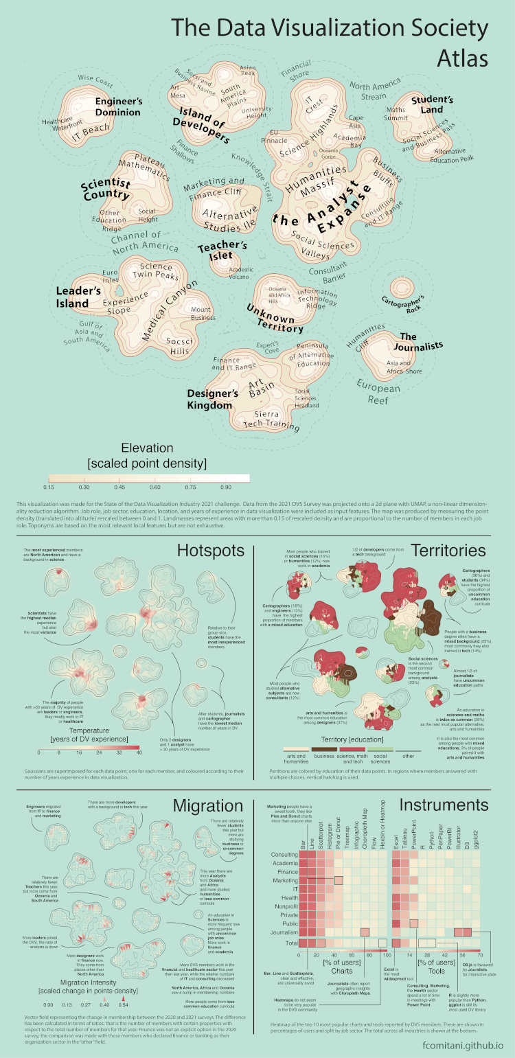
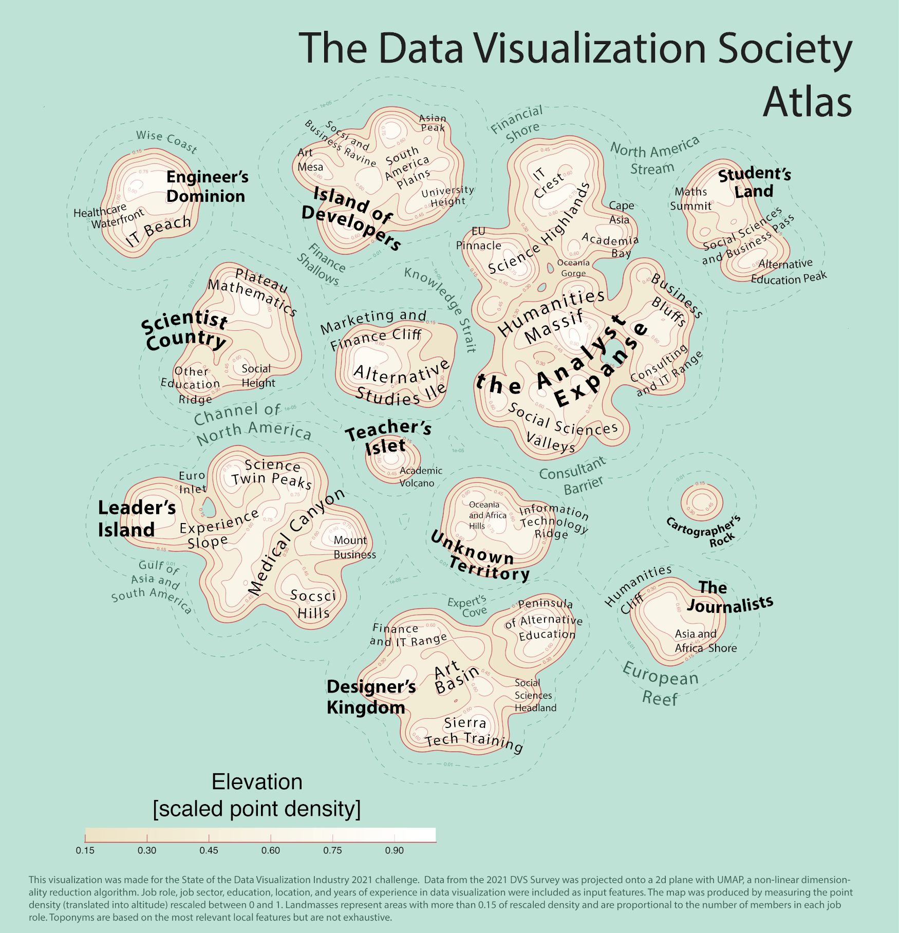
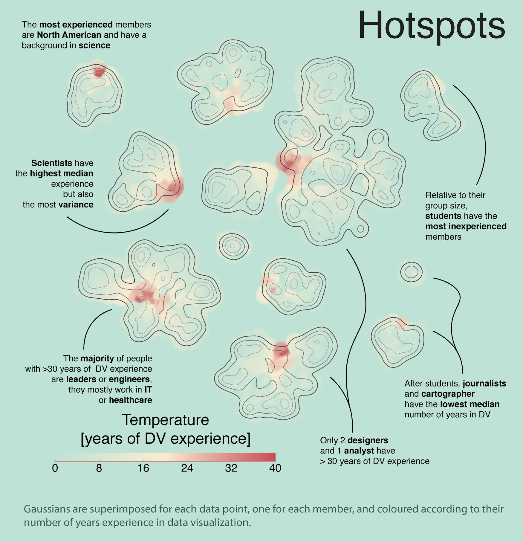
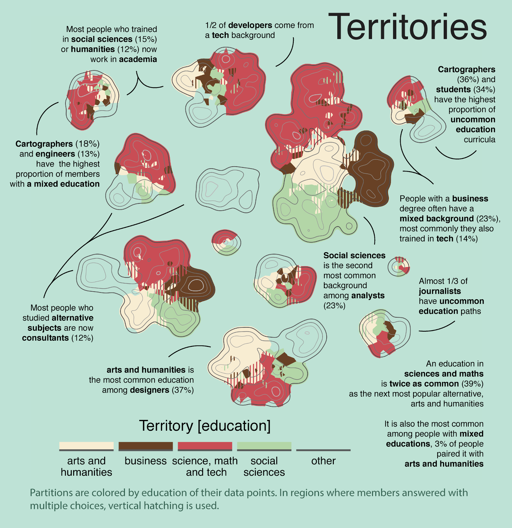
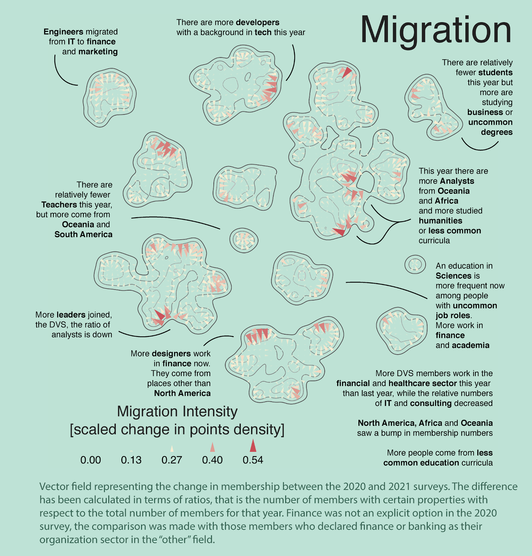
The map was obtained by projecting the survey data onto a 2d-plane and extracting densities to obtain a continuous representation.
The visualization mimics a topographic map, where land represents areas of high data points density and the sea areas where points are scarce or absent. The size of landmasses is proportional to the number of members in each job role and the altitude corresponds to the density of points in a certain region, brought together by common answers to the survey.
Toponymy is associated with the most characteristic property of the members found in that area, may that be their continent of origin, the industry they work in or their background.

At glance, one can see how the majority of DVS members are analysts or work in a leadership role, while very few are cartographers or teachers. Most people come from North America or Europe, they studied maths or tech-related degrees. IT is the most popular industry.

The DVS Atlas


The atlas is followed by three other panels showing different aspects of the same map. The first is the experience hotspots. Here, areas where members with more years of experience in data visualization concentrate are shown as having a higher temperature, with a more intense shade of red. Most of them are leaders and engineers.

The DVS Atlas


In the next map, the education background declared by members in each island is represented as territories of different factions and coloured accordingly. Territorial disputes, areas with vertical hatching, correspond to regions containing members who declared more than one education path.

The DVS Atlas


Migration patterns are shown in the third map, as a quiver plot, and display changes in membership between the 2020 and the 2021 survey. Arrows with a deeper shade of red and a larger area indicate regions where the most intense changes happened in the past year. Their direction goes from areas where more data points were present in 2020 to those where they are more abundant in 2021, relative to the total number of members. The flow shows people working in the financial sector are now more common, and more people from Africa and Oceania joined DVS.

The DVS Atlas


Different from the others, the final panel is a heatmap, showing the instruments used by DVS members to navigate the field. As before, a more intense shade of red corresponds to a higher percentage of people using the tool or chart. Bar, line and scatter plots are universally popular, heatmaps like this one, not so much. The distribution of popular charts and tools is similar across all job roles, except for journalists, who seem to be a bit more experimental with choropleth maps and prefer D3.js and Illustrator to Tableau.

The DVS Atlas